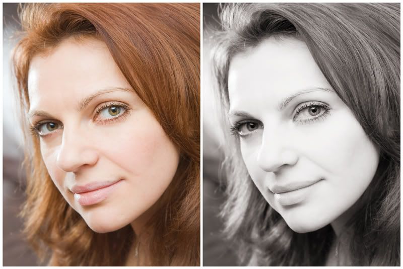
although I prefer color photographs to monochrome, monochrome has its points. When I look at those two portraits of Natalia Bull, I find it hard to choose which one I prefer - it really depends on the purpose. Color one has more information in it and would look great in a color layout, monochrome is probably more suitable for printing out and hanging on a wall.
I don't have full photoshop, but photoshop elements
One consequence of this conversion if that lips were de-emphasized. There was a thin layer of pale gloss on them, and contrast with skin is even lower in monochrome. Funnily enough, fire-engine red lipstick would would go as pale, so if we repeat the session at some point and want a higher contrast, we'd need a colder tone with less red - plum shade will work.
Toning was done with gradient map layer.
Natalia Bull is zumba instructor, and we had a lot more colorful zumba session with her as well - you can find it here


2 comments:
I like them both.
I guess you are correct, though, depends on the purpose of each.
I like them both too :)
Post a Comment